
Sharing is Caring ❤️
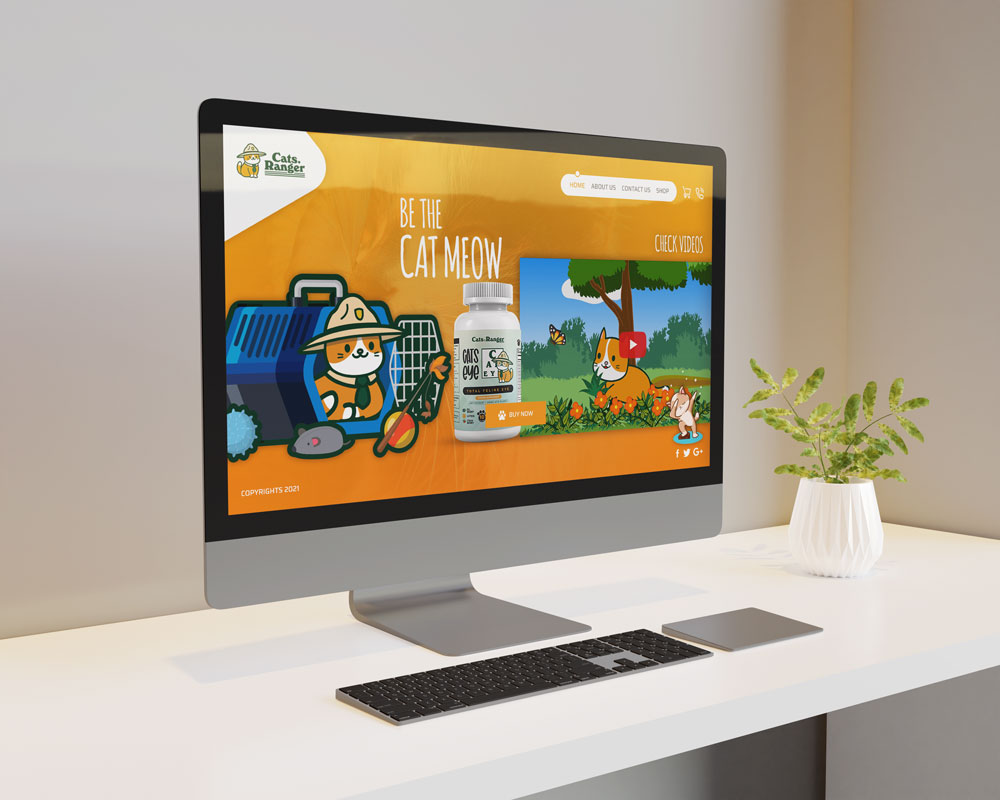
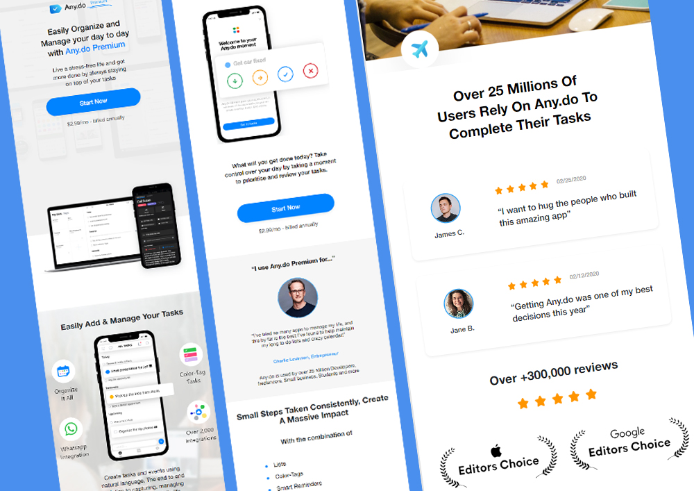
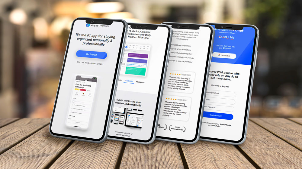
Responsive HTML CSS using Bootstrap – The Ultimate Framework
Build modern, mobile-friendly websites with Responsive HTML CSS using Bootstrap—the ultimate framework for fast, flexible web design.
Our expert developers craft stunning, responsive layouts that adapt seamlessly across devices and browsers. Harness the power of Bootstrap grid system, HTML5, and CSS3 to create professional websites with smooth navigation, optimized load times, and pixel-perfect design. Whether you’re designing landing pages, business websites, or portfolios, our responsive Bootstrap templates ensure full compatibility and clean, maintainable code. Learn to integrate Bootstrap components, custom CSS styling, and JavaScript plugins for powerful front-end performance. From beginner tutorials to advanced designs, upgrade your web development skills with Bootstrap responsive design principles and cross-browser compatible themes built using the latest HTML and CSS best practices. Achieve fast, elegant, and fully responsive websites effortlessly.